

background
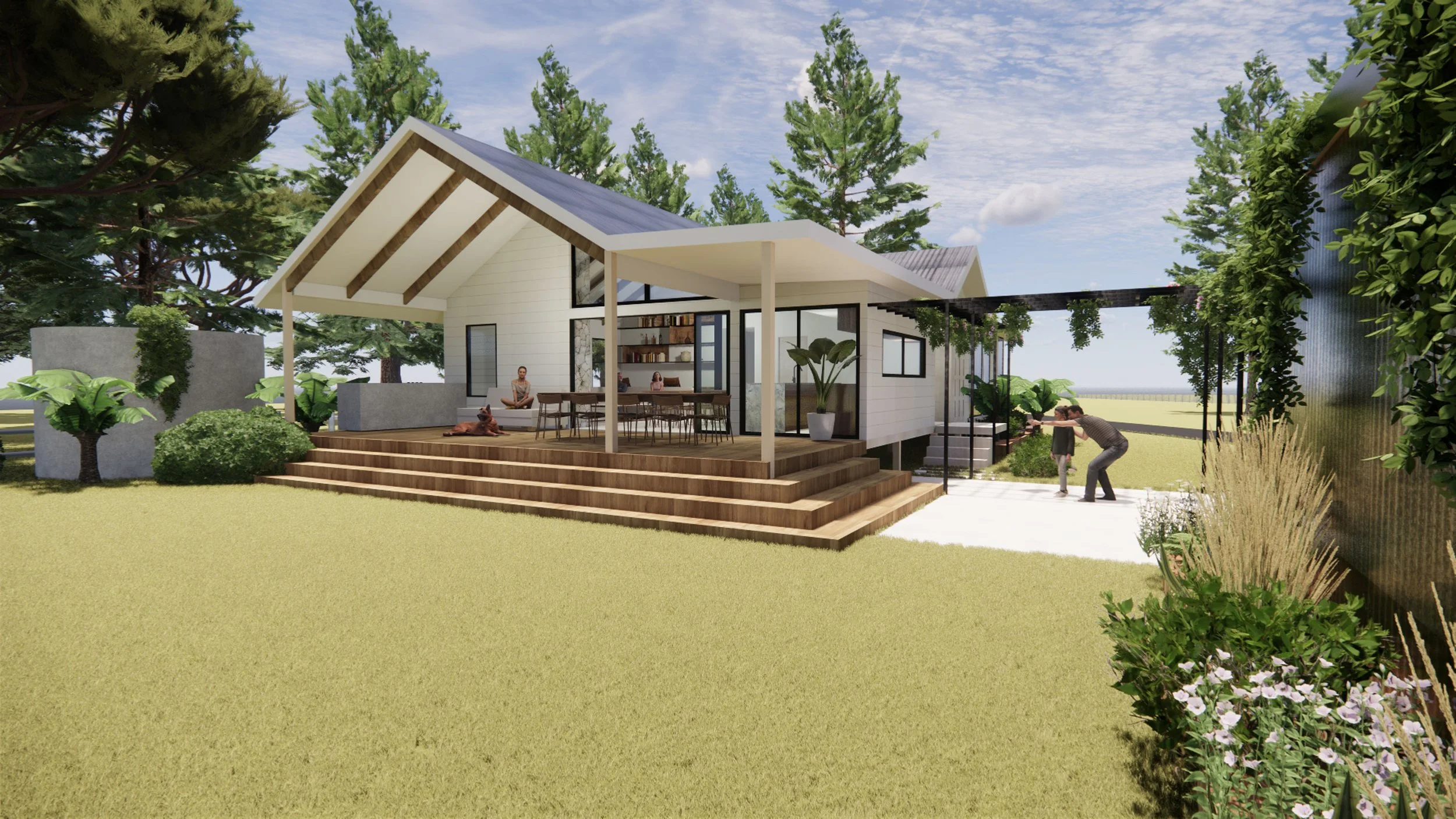
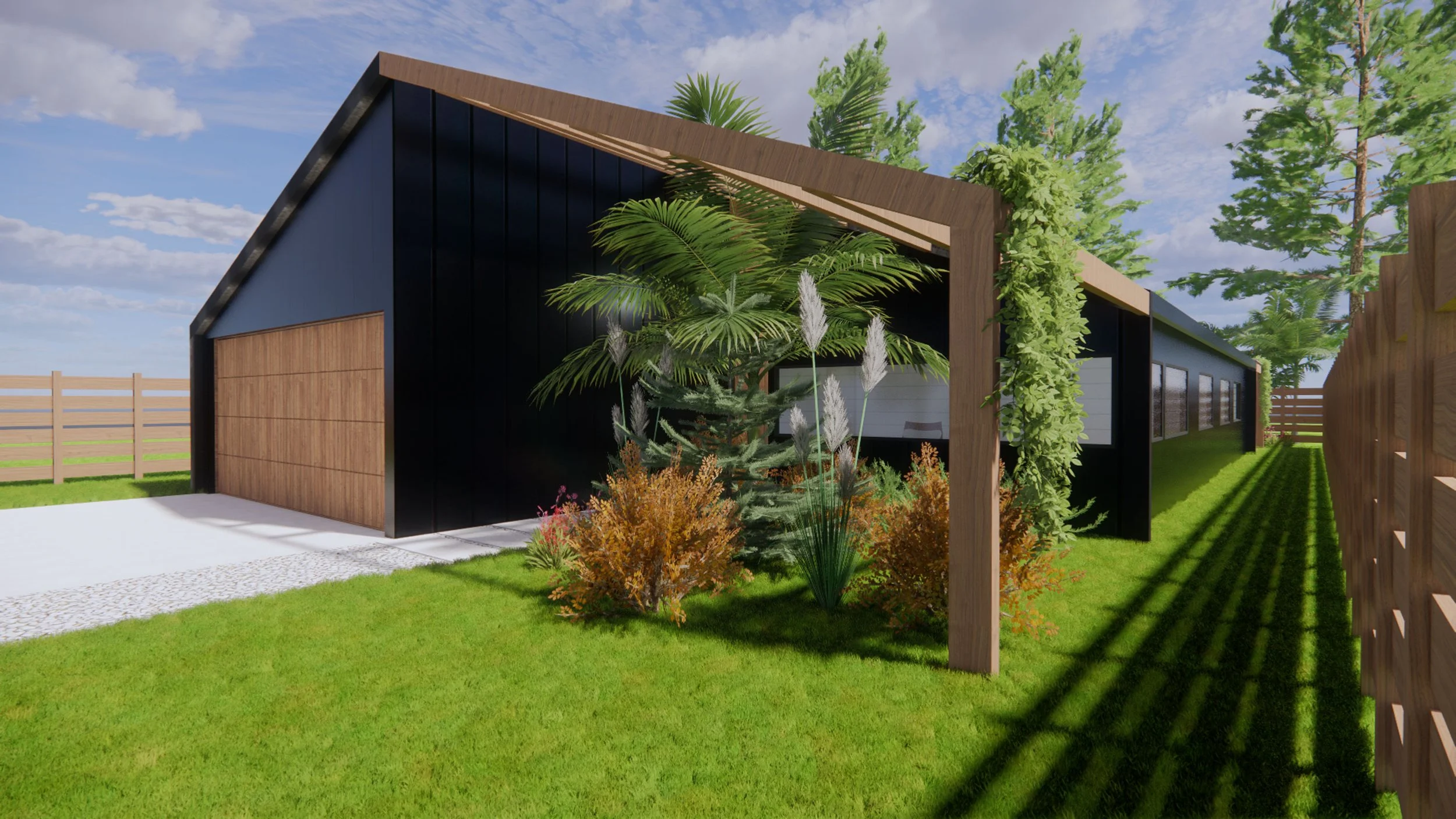
Tom Young Architects believe in a human-centric approach that respects the environment, and focuses on our human connection to the natural world. TYA emphasise sustainability, coupled with excellent functionality and timeless design. TYA keep their material palette to a minimum and utilise locally sourced natural resources that are sustainable, durable, and reflect the environment in which they are situated.
project
To develop a simple brand mark that represents the character of the company; in addition to a responsive portfolio website that provides a platform for the architectural work of TYA.
The logo (ligature) is a combination of the letters T,Y and A, placed together to form a memorable, recognisable brand mark. It was created using the corporate typeface (with slight modifications) and works simply in both black and white forms. When developing the TYA website, we put the projects front and centre. Each project is represented with bold photography and 3D computer generated video renders to showcase the design and the materials that were used. The website has intuitive, easy to follow navigation on both desktop and mobile platforms. We used the typeface Helvetica Neue throughout all TYA collateral. It is a simple and very legible font that positions the architectural work of TYA as the main focus.
CHALLENGES
Tom Young Architects are based near Byron Bay and Cooke Creative in Melbourne, therefore distance was the only challenge. (telephone calls and zoom meetings are a wonder.)
FROM THE CLIENT
"Been great working with you - the feed back has been really positive. Feels good to have everything sorted now and we have a platform to work with."