

BACKGROUND
The Sandy Point Community Group is a collection of community minded, environmentally aware local residents. The primary role of the group is to provide strong advocacy in support of improved facilities, infrastructure and recreational assets; and to protect the environment within the local area whilst fostering community engagement.
PROJECT
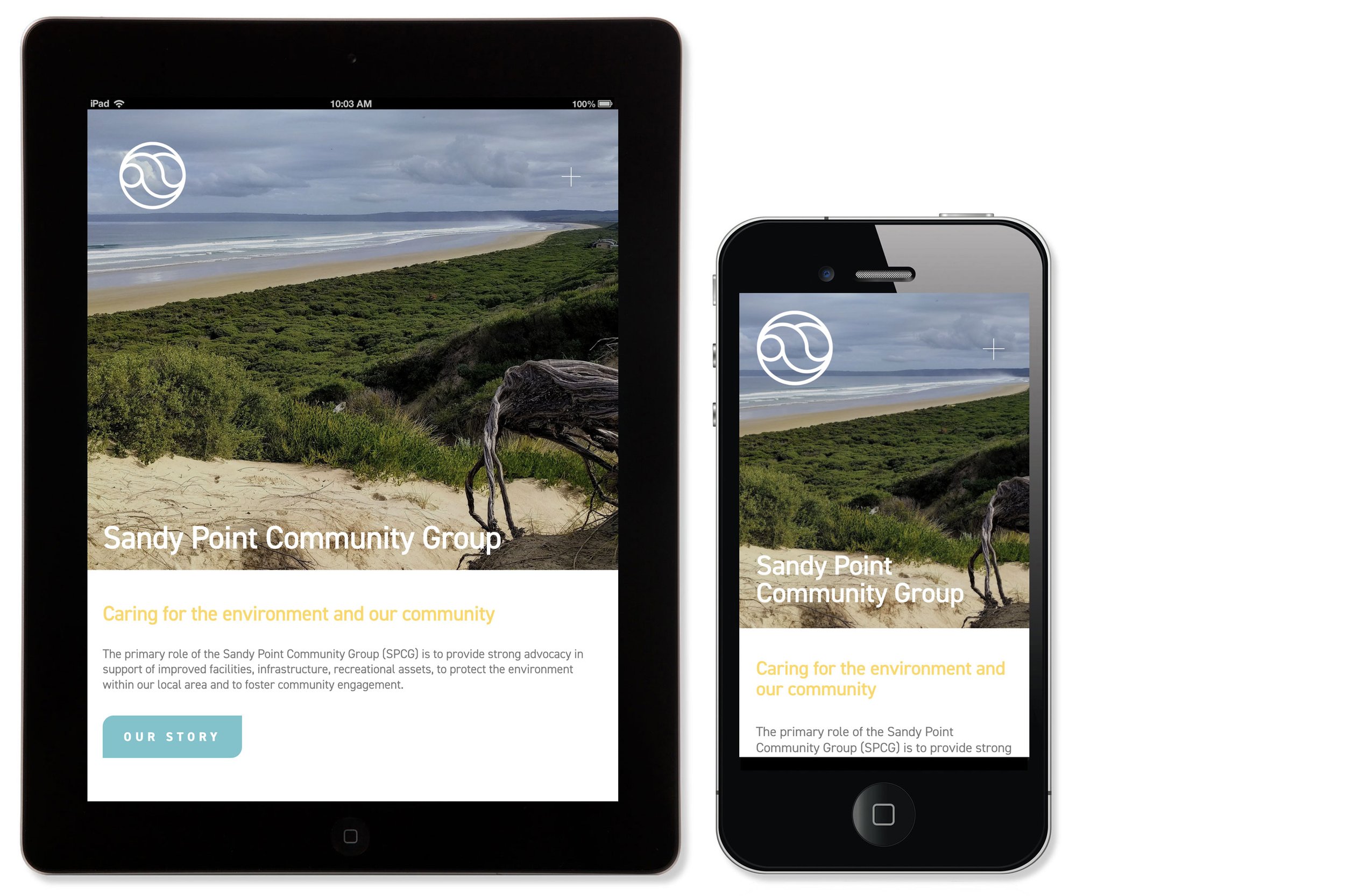
We designed a new brand mark and a responsive, easy to maintain website. The original website and branding were very dated and the SPCG members and community no longer felt that it represented them. The brand was also not digitally compatible with all social media, and the website did not adequately convey the genuine care for the community and environment possessed by the members.
SOLUTION
SPCG required a brand that would work on all digital media (their website being their main communication channel), social media and branded collateral; one that was simple, friendly, unique and communicated their message. A brand which included an 'icon' and a text ‘lockup’. We chose a palette of bright, summer colours to use throughout all branded collateral and the typeface DIN; with its bold simple forms, was the font chosen for its cleanliness and legibility. DIN is an 'OpenType' font, compatible across all OS platforms. (the same font file works on Macintosh and Windows computers.)
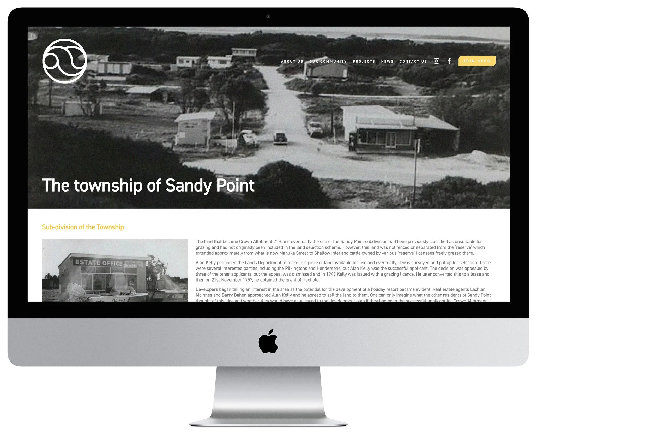
When developing the new web structure for SPCG, community engagement was our number one priority. We therefore placed our biggest focus upon the newsletter, events and news blog.
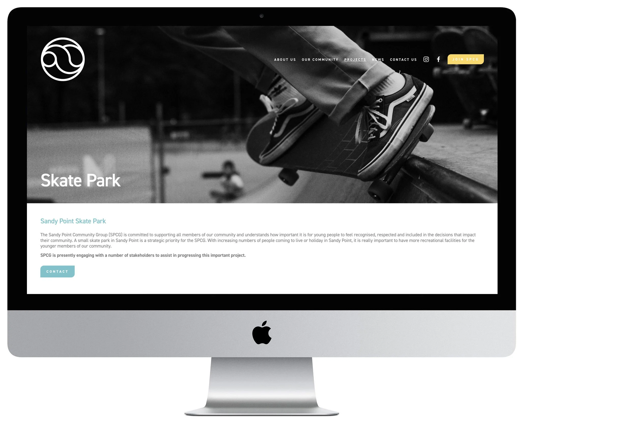
A community group needs members to maximise its positive effect, so a highlight button for joining the group was introduced to the main navigation panel. The website was also linked through to a payment gateway, so recurring membership fees are simple to keep track of. To catch the eye of the viewers we used images of the landscapes and the nature of Sandy Point sourced from a members library.
CHALLENGES
The main challenge when delivering a new brand mark for SPCG was to design a look that could incorporate all the elements of Sandy Point, the rolling sand dunes, the sea, the wild untouched bush and forests, and the community of people who call it home. Finding quality photographic assets was also a challenge, with many of the historic images having to be enhanced and optimised in order to be suitable.
FROM THE CLIENT
Thanks again for your work. I think the site looks great and will function so much better than what we had. I am glad I will never need to see the old, old site again!