

BACKGROUND
AllTrails is a leading tour company specialising in multi-day holidays in Australia. Since 1997, they have been running 10-15 top quality, fully supported, boutique-style tours per year, to all parts of Australia and a few special overseas tours. Respected for over 20 years in the business and renowned for meticulous care and preparation, AllTrails have a small team of enthusiastic and expert staff who look after their clients from the moment they make contact, right through to the completion of the tour.
PROJECT
Design and development of a new brand mark, a responsive website, print and digital collateral. The original branding and website was dated and their loyal clients couldn't relate to the look, it didn't express the detailed tour organisation and genuine care Alltrails have for their clients.
SOLUTION
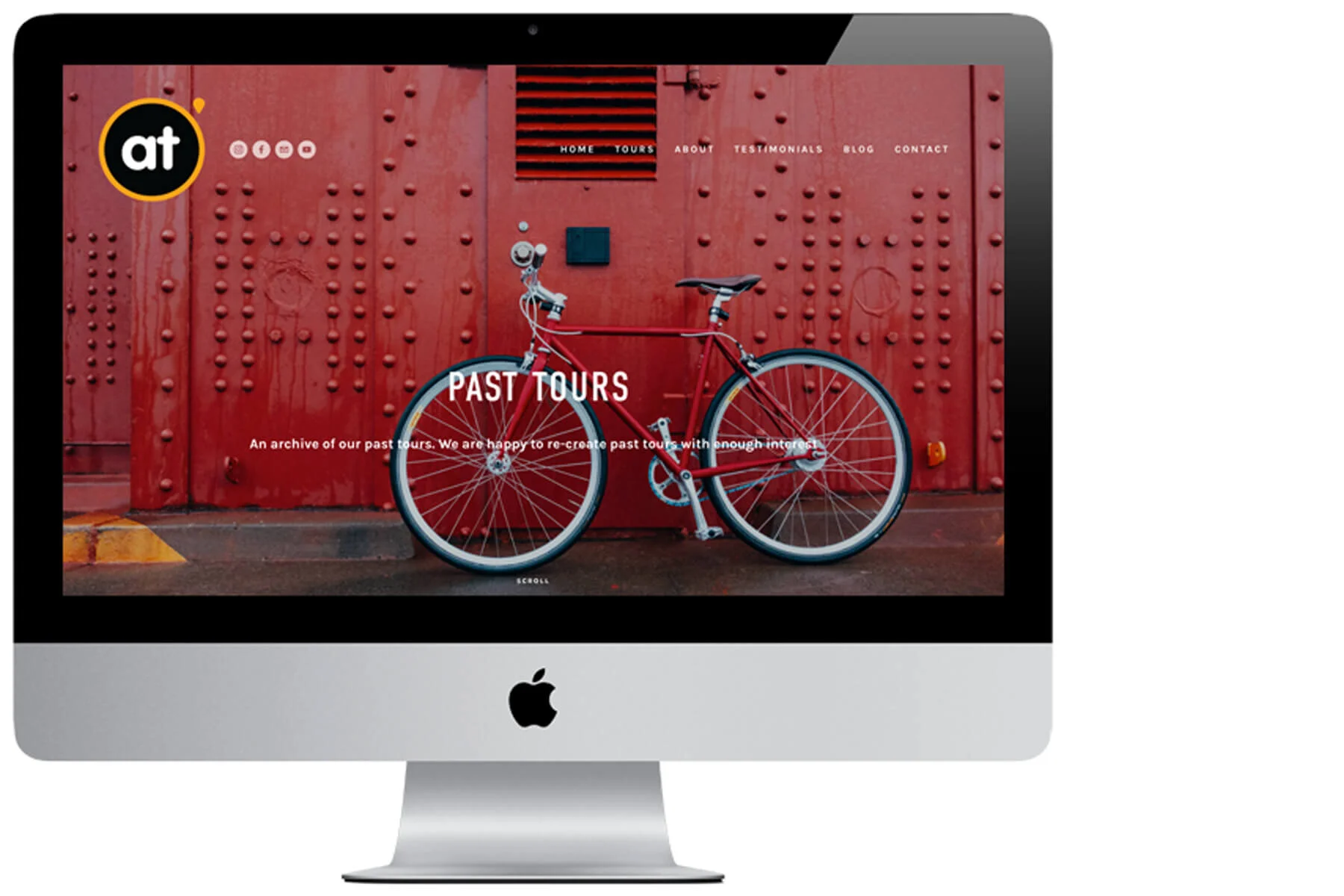
Alltrails required a brand that would work on all digital media (their website being the main communication channel), printed collateral, cycling jerseys, trekking garments and promotional equipment. A simple, friendly brand that depicted the care, camaraderie and meticulous organisation of the company. A brand which included an 'icon' with text which work together, and when separated. 'Vag Rounded’, with its soft corners and bold simple forms, was the font chosen for its friendliness, its simplicity and legibility. Slight modifications were made to make it even rounder and the 'location pin' was added for its relationship to maps and touring. It also adds an exclamation to the typography. The orange was retained from the existing brand, but modified to be a friendlier shade. The icon remains constant on all backgrounds.
When developing the new web structure for Alltrails the decision was made that wherever the viewer is on the website they would be confronted by beautiful imagery from the tours. The images are sourced from library photography (available on the CMS) and they showcase the stunning views the clients experience on each tour. Details of the tours can be found by a simple scroll or with just one click. Tour maps are designed to be simple and legible, they use the Alltrails colours, and the 'location pin' highlights each nights stay and places of interest. The images relate to the specific tour and showcase the scenes along the route. A detailed brochure of each tour is available for download (a PDF file) and follows the corporate design. As every Alltrails tour is recorded and saved in the website archive the viewer can reference these tours to read previous client experiences. A blog is updated daily - when Alltrails are on tour - and there is a huge archive of testimonials for potential clients to reference. The headline typeface chosen for the Alltrails website is DIN condensed, a clean, simple and legible typeface. The condensed headline allows for tracking (spacing) and the line-breaks on tablet and phone are less obtrusive. The typeface is an 'OpenType' font, the benefit being it's cross-platform compatibility. (the same font file works on Macintosh and Windows computers.)
CHALLENGES
The main challenge when delivering a new brand mark for alltrails was to design a brand that could incorporate future tours which could include walking and riding tours. Quality photographic assets was the main challenge for the website, each image had to show the viewer what they could see on the specific tour.
Results
Alltrails have seen (web analytics) an improvement in client interaction with their website and eDM’s. Tour enquiries and bookings are positive.