

Background
greyArmy is an established and well-respected Australian company. While home and property maintenance services are the core of their business, they also have a broad range of clients from the commerce, industry, government, community and retail sectors. Over the years, the company has grown substantially and their network of skilled trades people and clients have become younger and more diverse.
Project
greyArmy required a more professional and contemporary brand to reflect the more diverse demographic of their workers and clients. In addition, the company was expanding their offering into aged care and job re-training. The new brand needed to be adaptable enough to cover their expanded range of services and to work across a range of digital and print applications, as well as uniforms and various company transport vehicles.
Brandmark
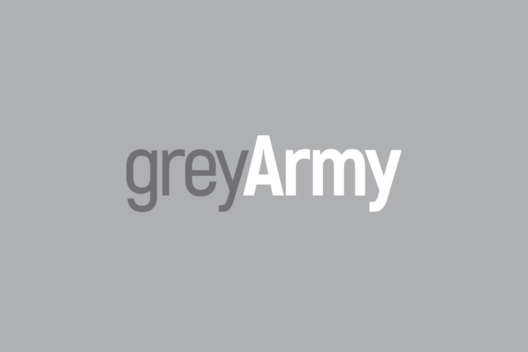
GreyArmy
greyArmy’s new branding needed to be eye catching, simple and adaptable. The client also requested it had something of the feel of the original brand to keep existing customers and clients on board. A typeface with a range of print and digital formats and many different weight options was rquired. The 'grey' is consistent across the entire group and services are depicted by the colour and weight of the typeface.
GreyCare
greyCare uses the lightest weight of typeface for a softer, caring look and feel. The light blue colour can be used as a bold background or to highlight 'Care' within the brand. This colour was previously used in greyArmy services, and has been carried over to the new corporate iD for consistency. The blue is used throughout the Corporate iD, in the uniform colour, on transportation and throughout all collateral. A combination of the grey and light blue creates a unique look for the care service while keeping it within the 'grey' corporate look and feel.
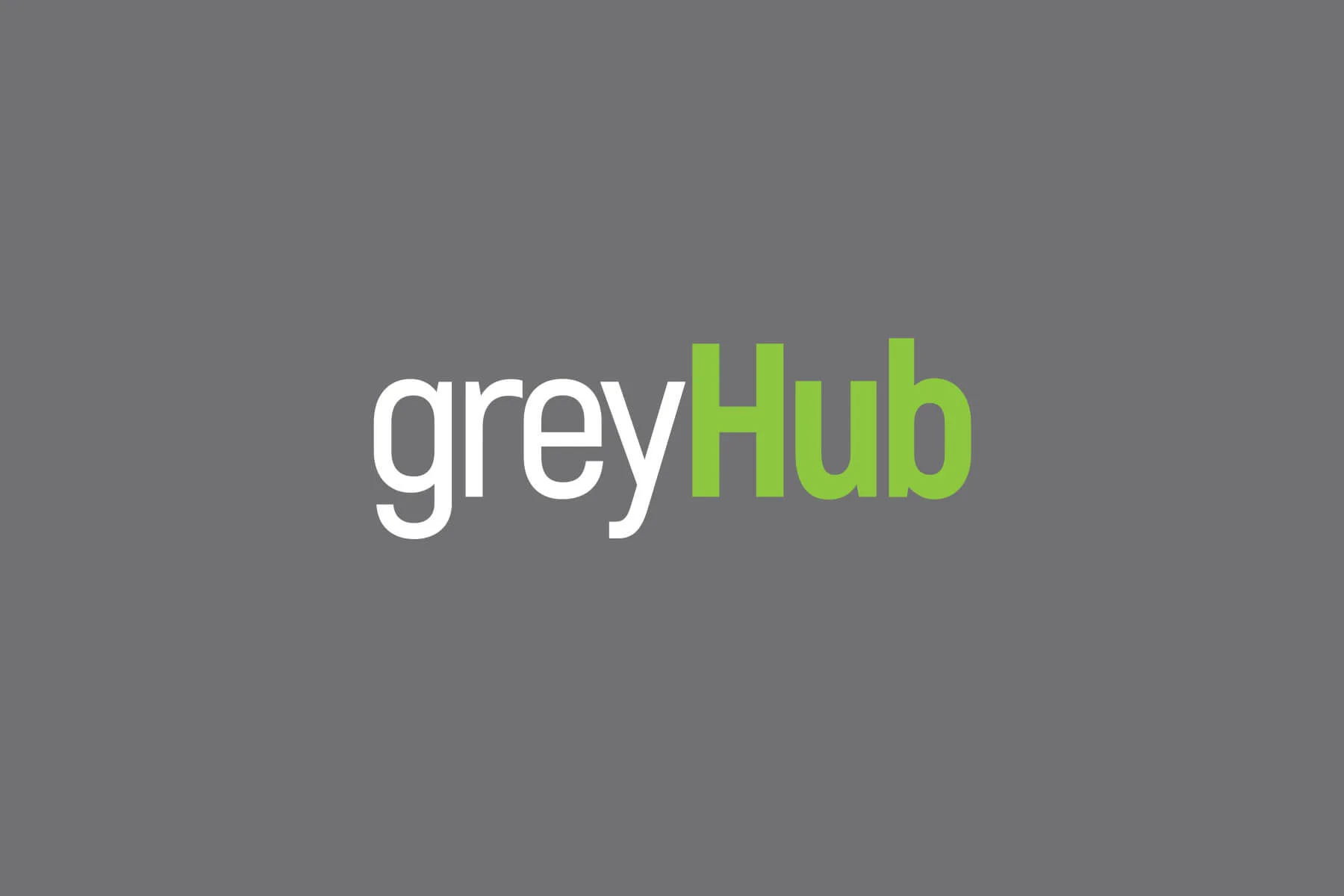
GreyHub
greyHub will be a re-training facility for people to transform their working life. With many workers now needing or wanting to work beyond retirement age, it’s often necessary for people to retrain or reinvent themselves. greyHub offers information, advice, courses and work experience. It is anticipated that many of those who retrain through greyHub will go on to work in the greyArmy or greyCare divisions.
Taglines
For each division of ‘Grey’ divisions we created a tagline to describe their core offering.
greyArmy - Tradies you can trust.
greyCare - Carers you can count on.
greyHub - Courses and advice to rethink your working life.
Challenges
The existing greyArmy brand was dated and no longer served the updated and extended offering of the ‘grey’ group. The choice of font was a challenge, as it had to be very legible, simple and adaptable to work on all collateral. The ‘grey’ brand uses the Akrobat typeface family for all communications. The Akrobat typeface is highly legible and has a simple modern feel that works for the ‘grey’ brand. Layouts are uncluttered, clean and very legible. Akrobat is a modern sans serif font with condensed proportions. Its narrow proportions makes it perfect for headlines, typographic compositions and short paragraphs of text.
Results
The greyGroup loved their professional and more contemporary new branding. greyHub will be launched in the near future.